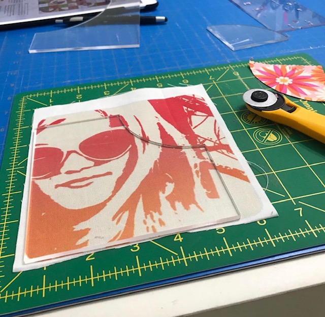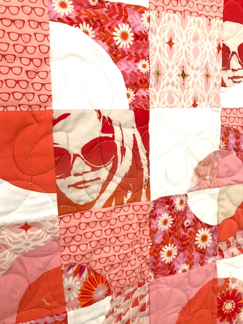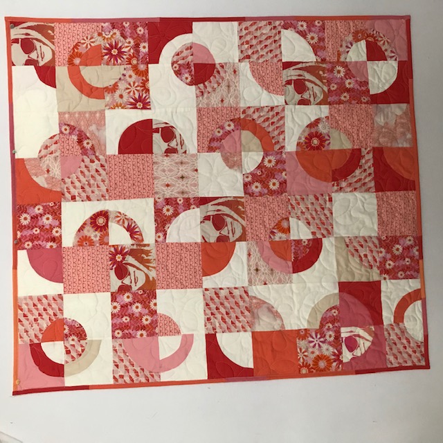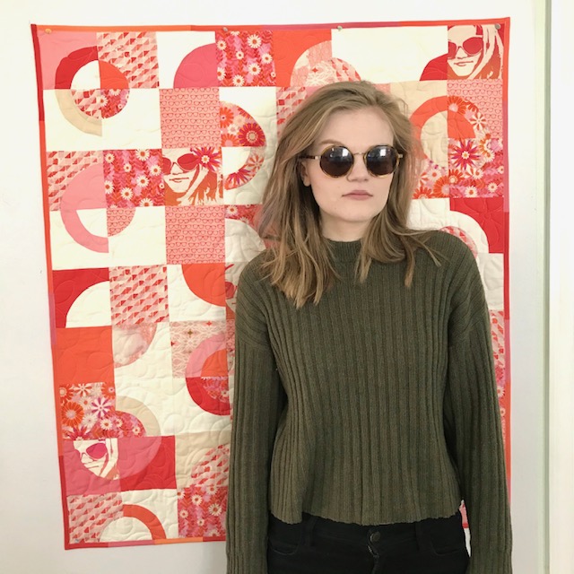
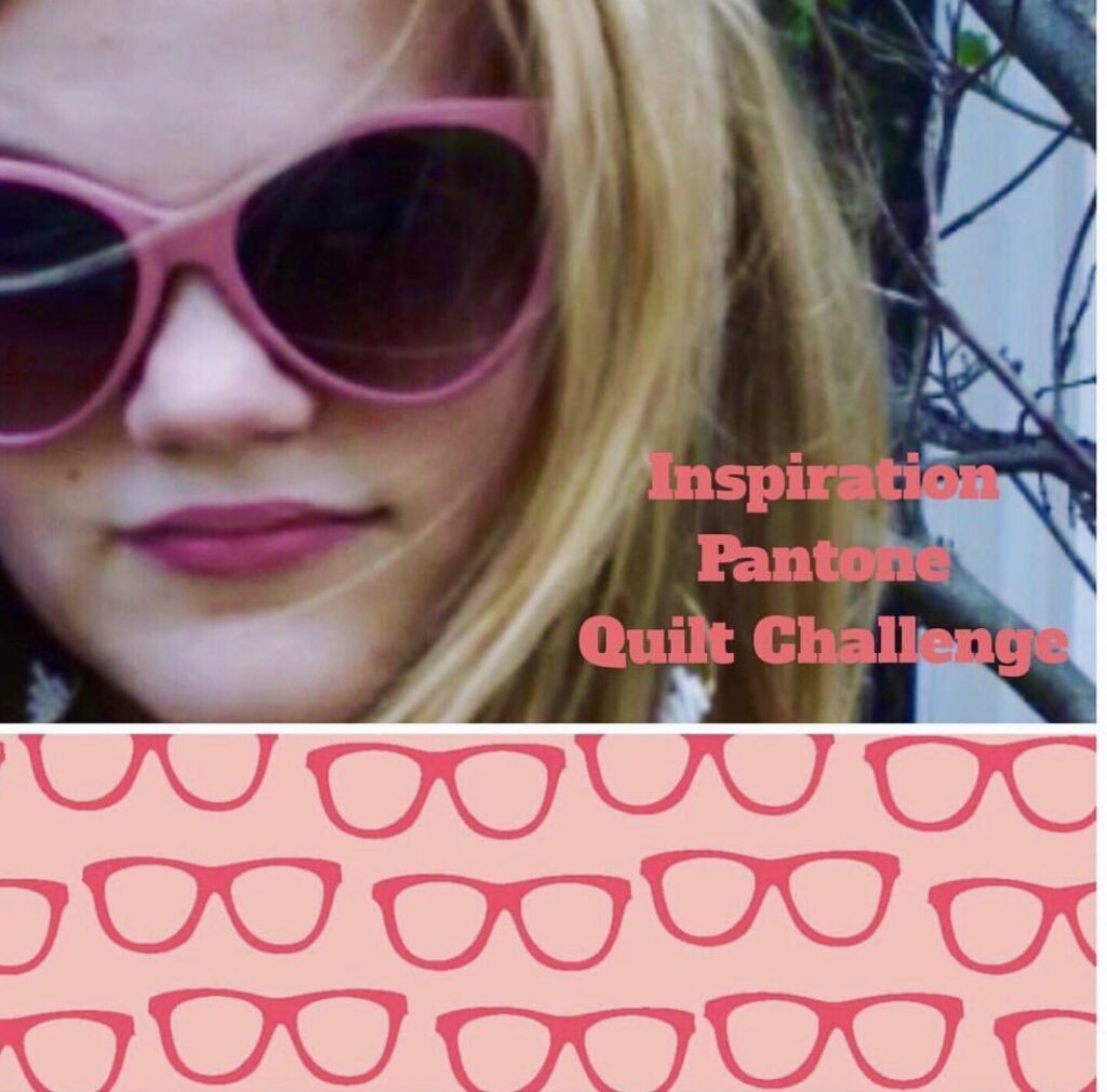
A few months ago when I came across this photo (see the photo below) of my youngest daughter in sunglasses, I knew I needed to convert it into a photo design and pair it with some fun sunglass fabric in either a quilt or pillow. It’s always been a favorite photo of mine, and in the back of my mind, I figured it would work well as a photo design.
Then the Instagram posts about the Pantone color of the year (living coral) challenge started popping up on my Instagram feed, and my mind went right to that photo. But first, I was hoping I could find sunglass fabric that would work within the living coral pantone palate. And amazingly I did. From a fabric seller on Etsy. Once I found this sunglass fabric, I was on a mission!!
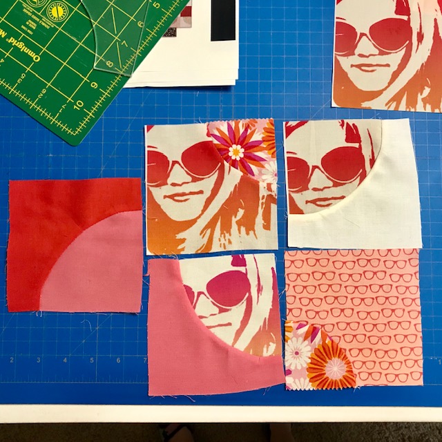
So I ordered the sunglass fabric, saved a photo of it on my iPhone and clicked on the Colorburn App. This App produces a pop-art design, and pretty quickly I was able to get the coloring correct and produce a design that was within the living coral pantone palate. I used either the poster or rainbow filter in the Colorburn App, and then brightened it a bit & tweaked the color a bit using the photo editing on my iPhone.
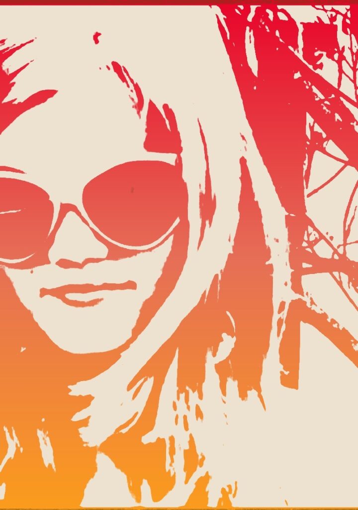
While doing this, I would refer back frequently to the photo of the sunglass fabric I had saved on my phone, to ensure the two worked well together.
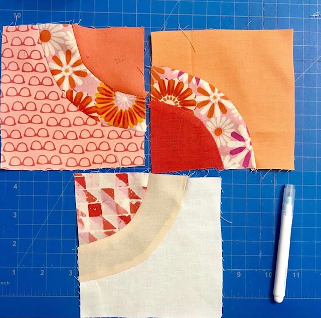
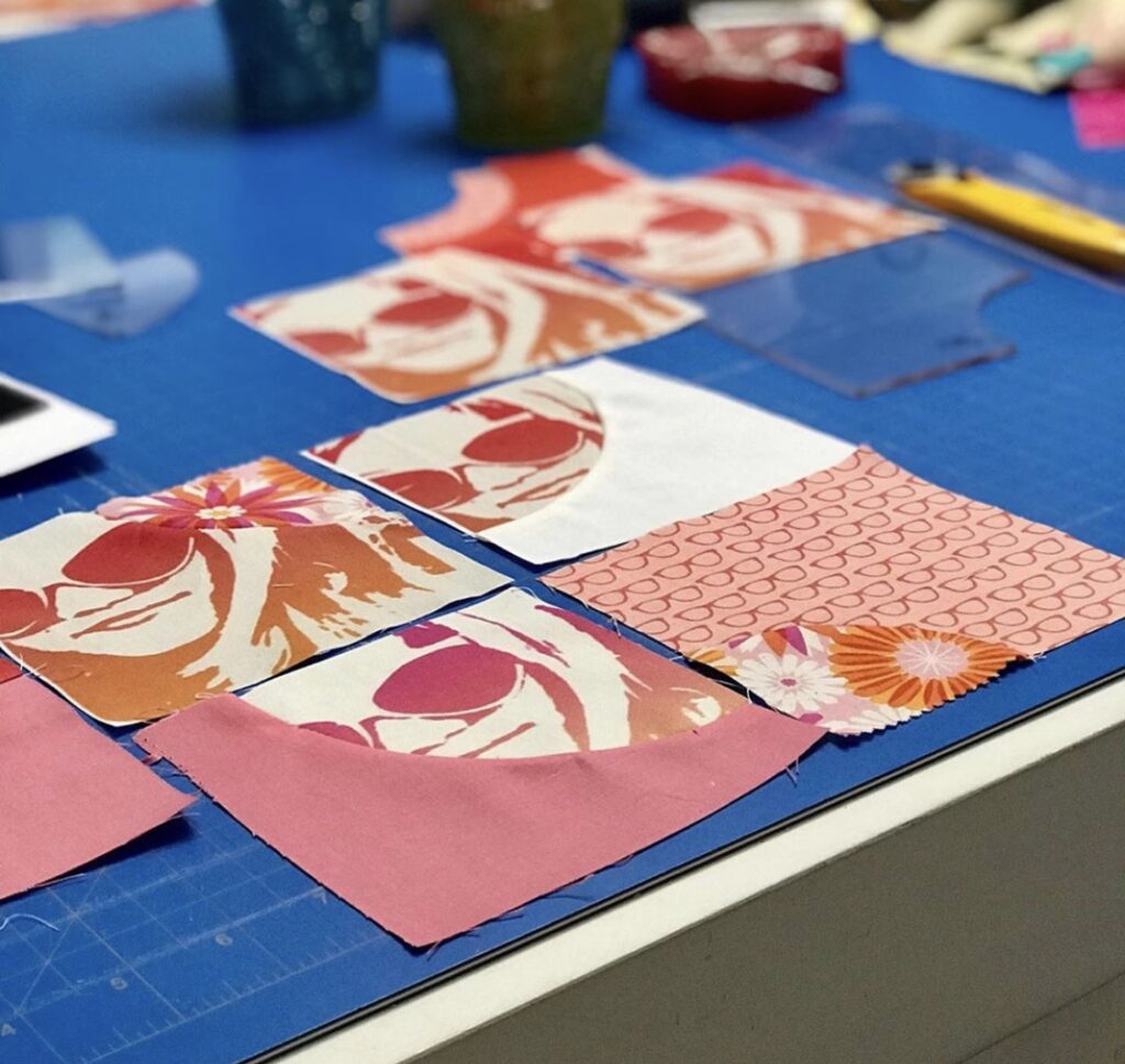
Next I needed to decide on a pattern. Originally I was going to do an improv’ pillow, but then I came across the Total Eclipse pattern by Shannon Fraser in the Patchwork and Quilting magazine. I realized it was perfect for using photo designs, as it has 6 or 7 squares in it. So now I had a pattern, but I also needed more fabric.
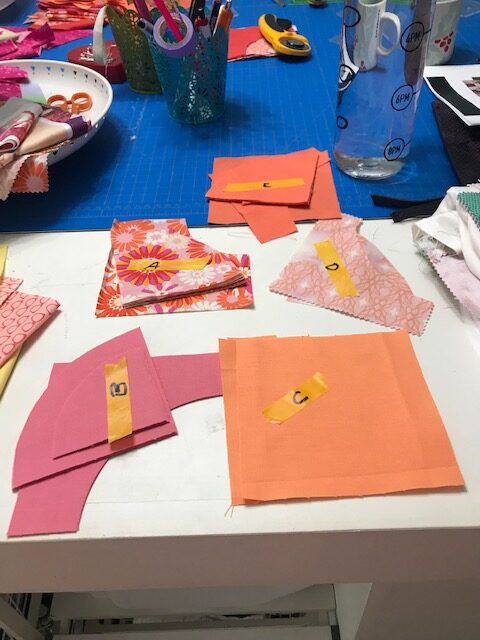
I went to my “stash” and was thrilled to find a pack of charm squares that included colors within the living coral pantone palate. I ordered a few fat quarters of the 5 fabrics that worked. The pattern calls for a combination of print fabrics and solid fabrics, and uses more solids than print fabrics. But I reversed it, and used more prints, and less solids.
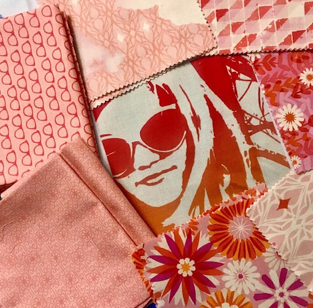
Picking out the solids, was the toughest part of the design process, Luckily my sister had recently sent me the Kona color chart with the fabric swatches, so I was able to sit with the photo design (which was now printed on Kona cotton fabric using Spoonflower) the sunglass fabric and the print fabric and do some matching. And then I ordered a lot of solids, to ensure I had a few extras colors, so I had some choices.
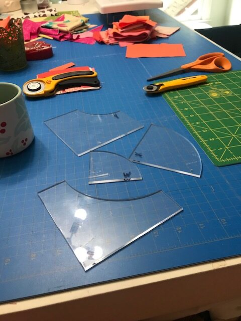
For cutting the pattern pieces, the Total Eclipse pattern uses templates. Again, my sister stepped up and helped me out on this – her husband has a laser cutter, so he was able to make custom acrylic templates for me.
Without those acrylic templates, cutting the pattern pieces would have been a real problem. Also, the pattern called for 7 inch squares, but I did 5 inch. It made for a smaller quilt, which is fine, as this will be a wall hanging.
This was my first time sewing curves, and I was unsure at first, but once you get the hang of it, it’s really not difficult at all. My curves may not be perfect, but I’m okay with some wonkiness here and there.
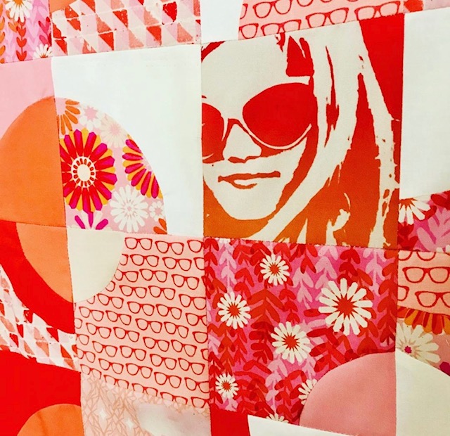
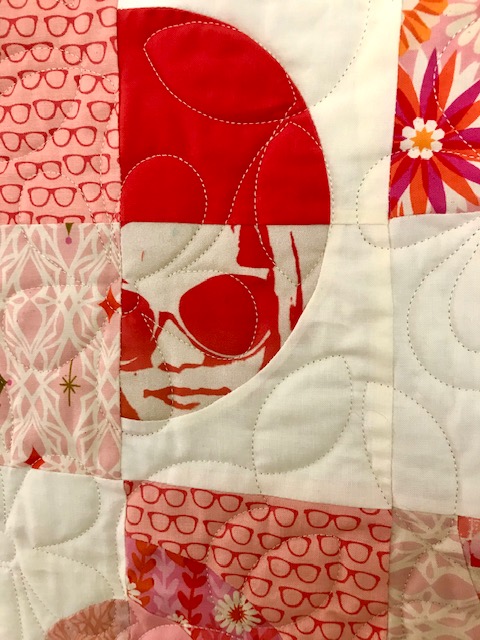
For quilting I sent this to Jubilee Quilting Co., a friend of mine in my quilt Quild, that is a long arm quilter. Isn’t it exciting to get your quilt back from the long arm quilter? It’s another step in the quilt making that I often refer to as the “icing on the cake.” For the quilting design, I debated on doing a circle but ended using a daisy pattern, to coordinate with the daisy fabric.
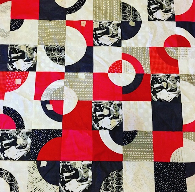
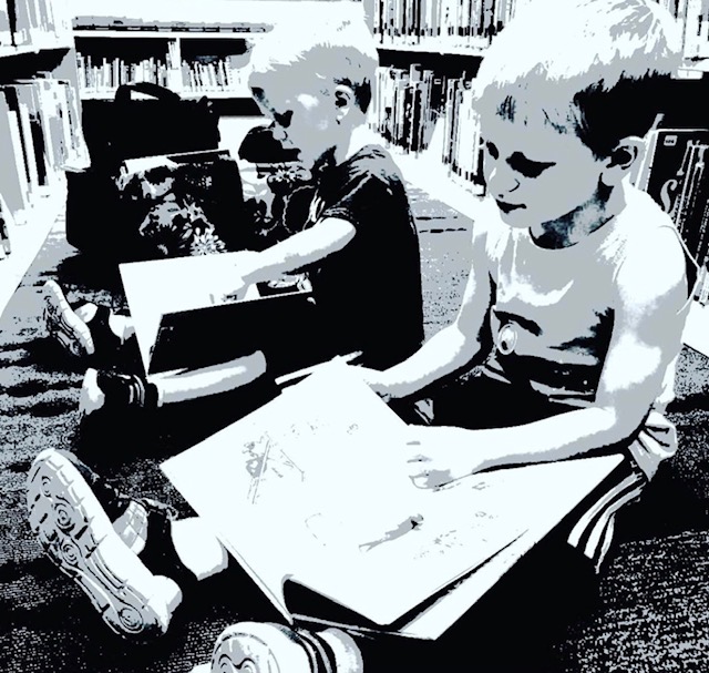
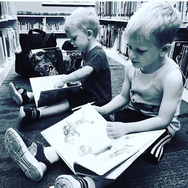
I was also able to convince another sister (I have 5 of them!) to also make this quilt, using photo designs of her two oldest grandsons. Her curves are a lot better than mine, as she’s been a quilter for many years and a very accomplished seamstress (she made many of my clothes growing up!).
This pattern is perfect for using photo designs, and it’s one I’ll make again, especially now that I have the acrylic templates. Thanks for reading and make sure to check out my Instagram feed @mattyjhb!!
